Reports
Report page is the landing page for the reimbfast application so that the user and manager can view the category wise consolidated/summarised data of the total expenses submitted in the form of charts like Bar chart, Pie and Donut.
Always click Save after making any changes to your artifact to ensure updates are stored successfully.
Create an Artifact
Follow the steps below to create a new artifact
- Navigate to the Dashboard → UI Fabric
- Open the Artifact section by clicking the "Artifact" tab in the navigation bar.
- Navigate to the application path: My Artifacts → Global-App-Group → reimbfast-app
- Click the (+) button at the bottom-left to create a new artifact.
- Enter a unique name for the artifact (e.g.,Reports).
- Click Create Artifact to confirm.
- Click Save to save the artifact and close the window.
Design a visual diagram
Add the Group Node
- Drag and drop Group node from Node Gallery to design canvas.
Position the Group Node
- Right-click the Group node.
- Edit the Group node's properties to make it full-width:
- column start: 1
- column end: 12 (This assumes a 12-column grid layout, adjust if your grid is different)
- row start: 1
- row end: Define this based on how much vertical space you want the group to occupy.
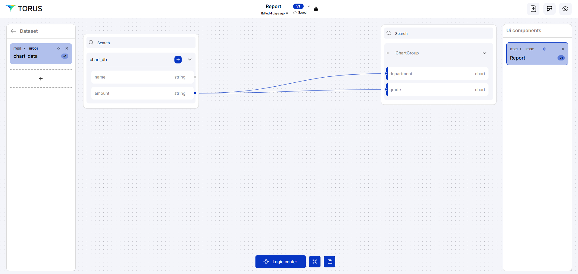
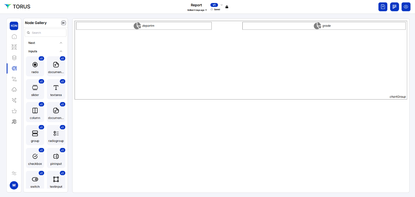
Adding Chart Nodes within the Group
Add the Chart Nodes
- Drag two Chart nodes from the Node Gallery into the Group node.
Position the Chart Nodes
For each Chart node, right-click and edit its properties to position it within the Group.
To display the charts side-by-side within the group:
-
Chart 1
- column start: 1
- column end: 6
- row start: 1
- row end: (adjust as needed)
-
Chart 2
- column start: 7
- column end: 12
- row start: 1
- row end: (adjust as needed)
For each Chart node, right-click and select the chart type (e.g., Bar chart, Pie chart, Line chart) based on the data you want to display in each chart.
Adding More Charts
- Repeat above steps to add more Chart nodes to your "Reports" to visualize different aspects of reimbursement data.
- We can use Group nodes to arrange multiple charts to have a visually appealing layout.
Orchestration
- Use Orchestration to map the data from your datasets to each Chart node.