User Home Screen
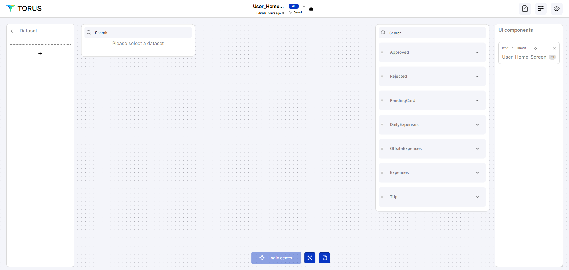
User home screen page has 5 tiles at the top of the screen which displays the number of count for the status of all the submitted expenses and the type of expenses. Status of the expenses are Approved, Rejected, Pending and the type of expenses are Daily expenses and offsite expenses. There are two tables in the page for Daily expense and offsite expense. It allows the user to view the claimed expenses for Daily expenses and the offsite expenses. It also allows the user to submit the form for Daily expenses and offsite expenses with the required details.
Always click Save after making any changes to your artifact to ensure updates are stored successfully.
Create an Artifact
Follow the steps below to create a new artifact
- Navigate to the Dashboard → UI Fabric
- Open the Artifact section by clicking the "Artifact" tab in the navigation bar.
- Navigate to the application path: My Artifacts → Global-App-Group → reimbfast-app
- Click the (+) button at the bottom-left to create a new artifact.
- Enter a unique name for the artifact (e.g., User Home Screen).
- Click Create Artifact to confirm.
- Click Save to save the artifact and close the window.
Design a visual diagram
Positioning of Components
Effective UI component positioning ensures a clean layout, intuitive navigation, and seamless user interaction. Components should be organized based on user flow, with primary actions placed prominently and supporting elements positioned contextually. Consistent alignment, spacing, and visual hierarchy enhance readability and usability across devices.
12-Column Grid Layout
The page is structured using a 12-column grid system, allowing precise placement of components based on defined column spans and row positions. This layout ensures consistency, flexibility, and responsiveness across different screen sizes.

- The dashboard will contain 5 components, distributed across the 12 columns.
- 2 tables will be positioned below them with appropriate spacing.
These properties define where a grid item starts and ends on the grid—both horizontally (columns) and vertically (rows), column start specifies the starting column line of the grid item. and column end specifies ending column line of the grid, row start defines where the item begins vertically, row end defines where the item ends vertically.
Placing Components in the Structure
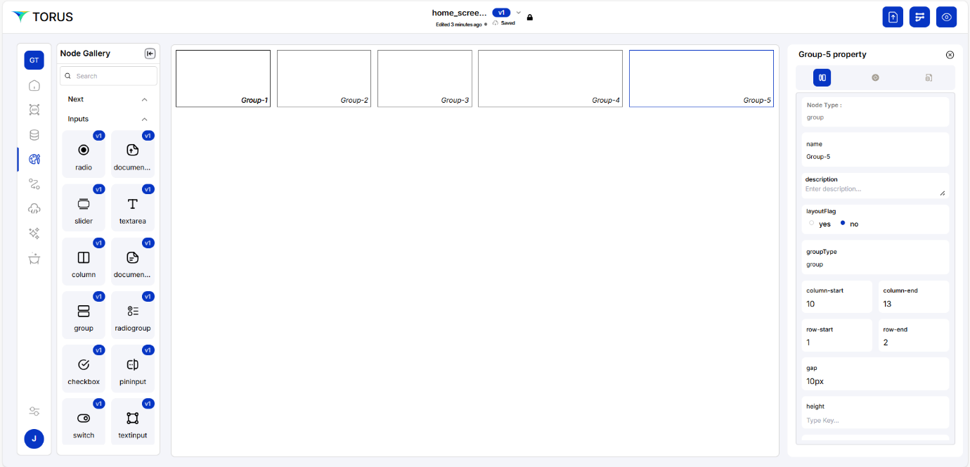
Designing the Status Summary Section (Top Row)
This section uses Group Nodes to arrange Card Nodes horizontally, each displaying a claim status summary.
Create a Group Node
-
Add a Group Node
- Drag and drop a Group Node to the design canvas.
-
Edit Group Node Properties
- Right-click the node → Click Edit Node.
- In the Name Field, enter accepted.
- In the ElementInfo property, update the Label Field to Accepted.
-
Position the Group Node
- Refer to the 12-Column Grid Layout for positioning.
Create Additional Group Nodes
Follow the steps given in Create a Group Node to create multiple Group Nodes in the below names:
- Rejected
- Pending
- Daily Expenses
- Offsite Expenses
Create a Card Node
-
Add a Card Node
- Drag and drop a Card Node inside a Group Node.
-
Edit Card Node Properties
- Right-click the node → Click Edit Node.
- In the Name Field, enter accepted.
- In the ElementInfo property, update the Label Field to Accepted.
-
Position the Card Node
- Refer to the 12-Column Grid Layout for positioning.
Create Additional Card Nodes
Follow the steps given in Create a Card Node to create multiple card Nodes in the below names:
- Rejected
- Pending
- Daily Expenses
- Offsite Expenses
Now, the Status Summary Section is structured using Group Nodes and Card Nodes to display claim statuses in an organized manner.
Create a Table
-
Add a Table Node
- Drag and drop a Table Node to the Group Node.
-
Edit Table Node Properties
- Right-click the Table node and select Edit Node.
- In the Properties panel (right-side), update:
- Name: dailyexpenses (used for backend reference)
- In ElementInfo tab:
- Label: Daily expenses (display name)
- Enable:
- Pagination
- Table selection
- Table settings
- Table sorting
-
Table Positioning
- Column Start: 1
- Column End: 13 (Full width of the group)
Create Additional Table Node
Follow the steps given in Create a Table to create multiple card Nodes in the below names:
- Name: offsiteexpenses
- Label: Offsite expenses
Insert Columns into Tables
Define Columns for Daily Expenses
- Drag and drop Multiple Column Nodes to the Daily Expenses Table.
- For each Column:
- Right-click → Edit Node
- Set Label to:
- Category
- Amount
- Status
- Date
Enable “Add” Button for Daily Expenses
- Drag and drop a Button Node to the canvas.
- Right-click → Edit Node
- Set Label to: "Add"
Define Columns for Offsite Expenses
- Drag and drop Multiple Column Nodes to the Offsite Expenses Table.
- For each Column:
- Right-click → Edit Node
- Set Label to:
- Name of the offsite expenses
- Amount
- Status
- Date
Enable “Add” Button for Offsite Expenses
- Drag and drop a Button Node to the canvas.
- Right-click → Edit Node
- Set Label to: "Add"
Adjust Sizes and Positioning
- Adjust Row End properties for a clean, responsive layout
- Table Nodes
- Text Nodes
- Button Nodes
Orchestration
Orchestration manages the interaction between Data Fabric (DF) and UI components. It enables Node-level data flow,Form-level search and Field-level integration. Ensures seamless data movement and UI behavior across the app.
To add orchestration logic, click on the + button on the left side of the Orchestration panel.
After clicking ‘+’, below screen will appear
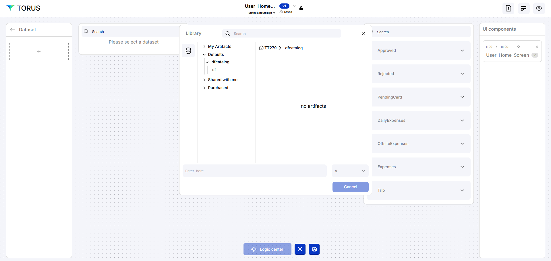
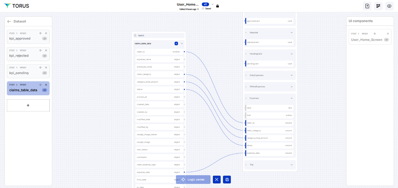
Click on ReimFast to get the artifacts, Select the required artifacts
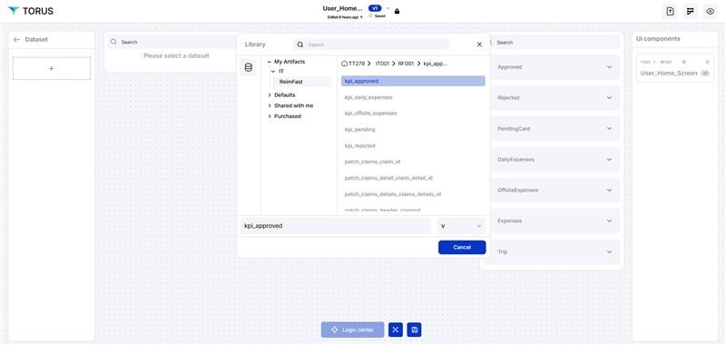
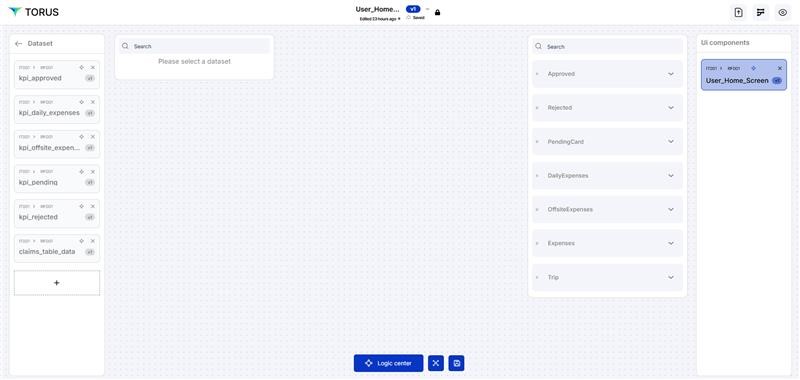
In the screenshot we have selected ‘claims_table_data’ dataset and we will get the relevant UI components on the right hand side, whereas the left hand side shows the Dataset. As we select the dataset, relevant UI Components will appear on the right hand side, we need to map respective UI component with the respective data field.
Logic center
Logic Center allows the developers to define and manage all the business logic, interactions of an application, and permission level of the user
To organise the functioning of the application by configuring Security, Events, Actions, Rules, and Custom Code (SEARC)—all in one place. Refer here for details.
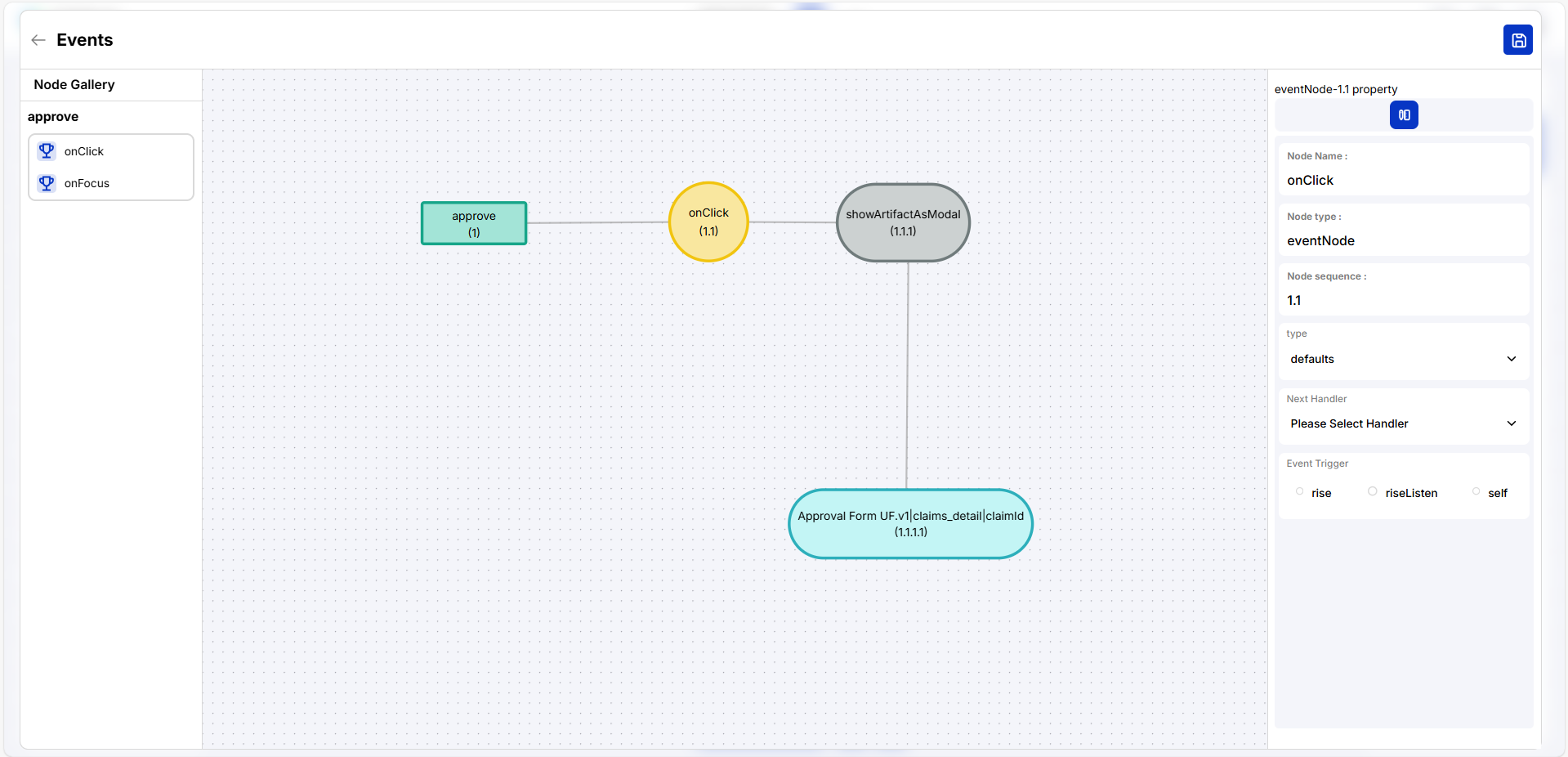
For each button in the table, we have to define the action of the button which will be done in Logic Center. Here if we click one button, a form should be loaded to show the Artifact event which will load a page with its properties. Another button should add a additional form to define ‘daily expenses’ or ‘offsite expenses’.
Click on the UI component (User home screen) and click on the right hand side UI component which will enable the Logic center, once it is enable click on the same to open (refer the screenshot below).
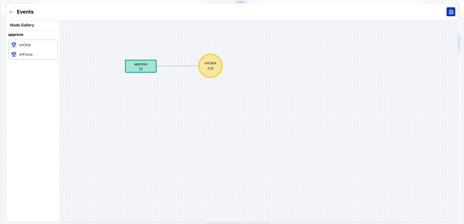
Click Add on the left side as per the below screenshot and click on the Events button at the bottom.

After clicking Add below screen will appear
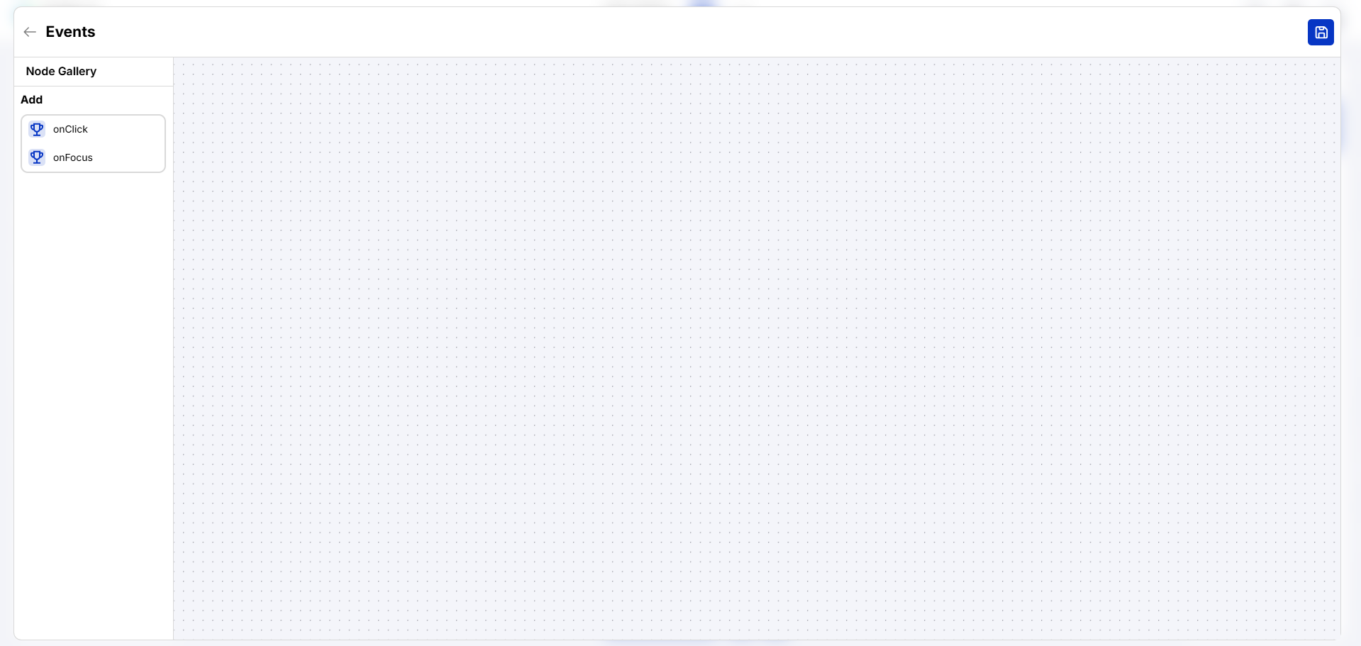
After clicking onClick below screen will appear
Right click on ‘Onclick’ to get the properties on right side. Click on Riselisten
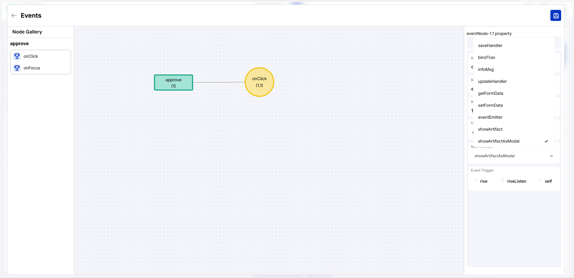
The following properties will be appeared and select the appropriate values in the drop down
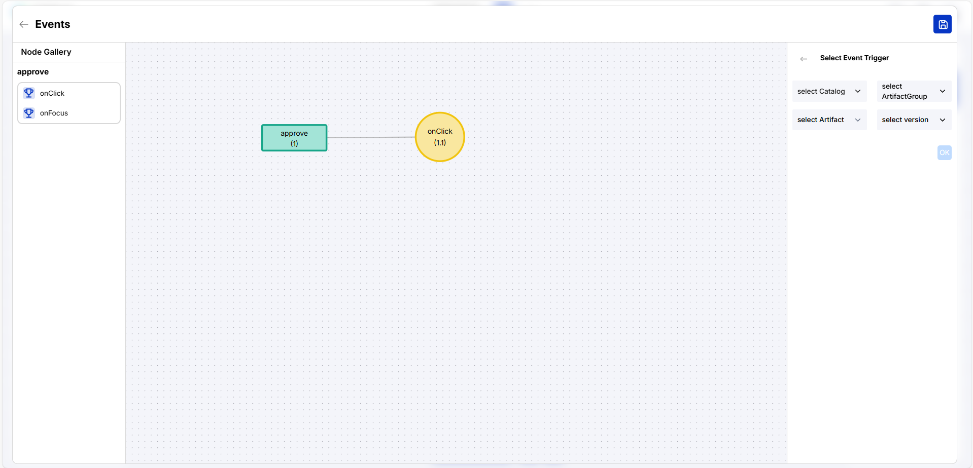
Update the properties as applicable. Click Ok
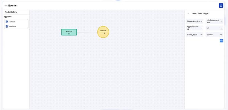
Update the properties as applicable
Organization matrix is a concept in Torus where roles were defined in control centre. Under the Logic center in the Security tab, we will map the user roles accordingly
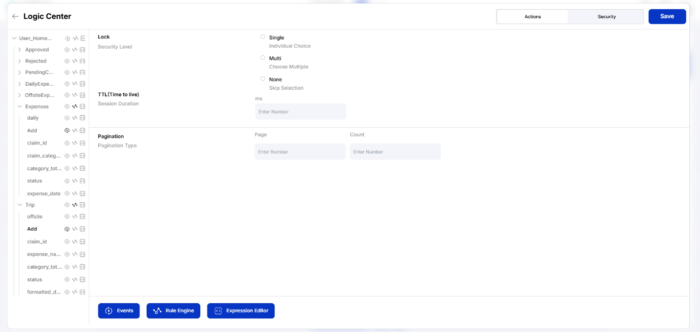
Rule Engine – It is required to fetch data from one or multiple table depending on the given condition/rule. It adds rule to a component.
Select the required table from the left hand side and click on the Rule Engine
To add a rule to the Expense table on this page, first navigate the left-side menu in the Logic Center and select the 'Expense' table. Once selected, click the 'Rules' button located at the bottom of the Logic Center interface. This will open the Rule Engine or Expression Editor, allowing you to define your data processing rules.